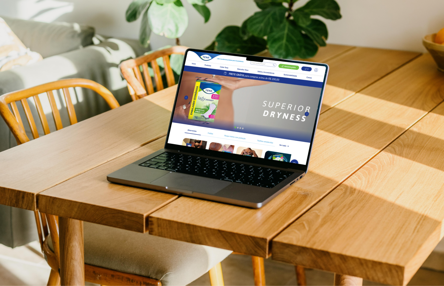
E-commerce Redesign
Role and duration
Sr UX/UI Designer.
Team: Charline Chávez & Jorge Veloso.
February, 2022 to July, 2022.
Resume
Tools used were Figma and FigJam. Activities made were Heuristic evaluation, Site maps, Information architecture, Benchmark, Moodboards, Wireframes, Mockups, Prototyping, Usability testing, Dev handoff. Tech framework used is Vtex.
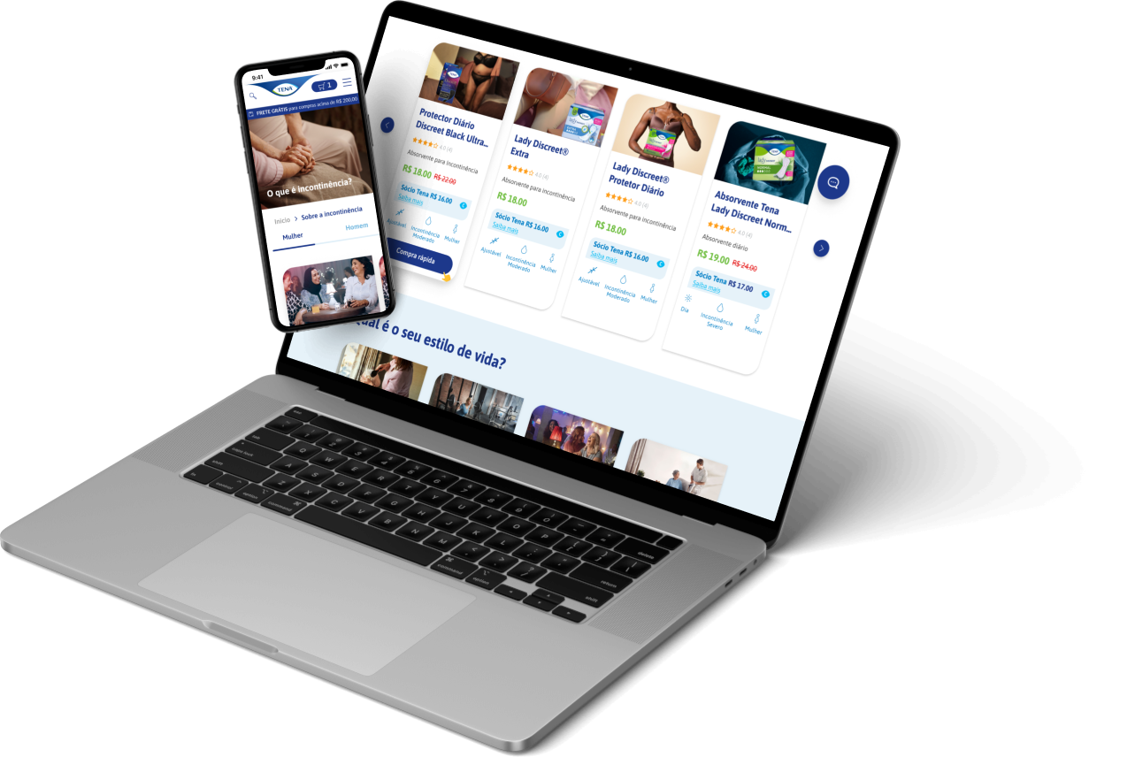
Launched site
Design process
After the Kick-off we needed to understand the complete business needs and expectation Tena’s team had for this redesign. So, we organized a couple of workshops to get to know their thoughts and, why not, get to know each other. As a conclusion of the workshops we understood that the main objective was:
“Identify the friction points users are having in the actual website so we can enhance the experience and improve the website sales.”
Heuristic evaluation and Usability Testing
Evaluating the current site
To understand better the redesign mission, I recruited other two UX team members to make an Heuristic evaluation based on Nielsen 10 Heuristic Principales. We evaluated carefully each aspect and site flow.
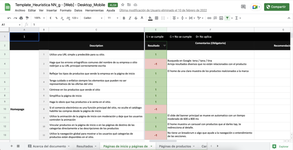
In the meanwhile, UX research team carry out usability tests on the current website with a focus group (pregnant women and people with incontinence issues).
The research testing results output was:
- Interactions were not clear. User had to guess how to navigate through sections.
- Information was difficult to find. Products were hidden, specially products for different user targets. People thought that blog information will direct them to the products.
- Confusing to understand how to buy products. Information was in disorder and had no logical structure for mental models.
- There were too many steps to accomplish the purchase. Instructions were not clear and some information in the forms were repeated.
- User were confused about differences among cards products. They thought some of them were repeated.
- Unnecessary amounts of text, also difficult to read for elder users because of font px size.
Site maps & IA
What we have vs. what we want to improve
In resume, the research results obtained in the usability tests and heuristics evaluation threw that the main problem is the disorder in the information hierarchy and how hard is to navigate through the site.
I decided to document the actual site to fully understand how the information was clustered and, afterwards, start my own info architecture proposal. The new sitemap included better structured levels of information that I presented and validated with the stakeholders.

Wireframes and VTEX framework
Once the Architecture was approved (with some iteration improvements, obviously 
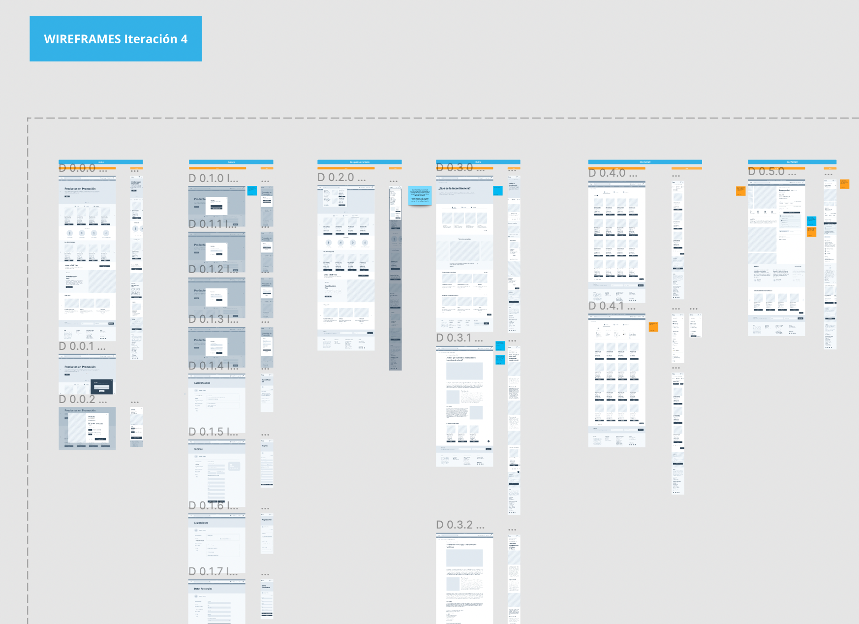
To start designing lo-fi Wireframes, we translated the site maps into IA graphs. This helped us plan how to structure and order the data in a more visual way and tackle the highlights from the usability tests.
Meanwhile, we also made some research and spoke with Dev team to understand the design limitations and tech styleguides that VTEX has. We based our design decisions in the main VTEX Styleguide
Lo-fi Wireframes
The lo-fi wireframes process was smooth because of the previous work. We tackled most of the problems mentioned above by doing hypothesis. For example, navigation bar needed a Home button because focus users got constantly stuck through the navigation flow because they had to guess that in the current site the Logo was the “back button” to Home. Similar interactions where user had to guess next steps made them feel frustrated and, therefore, leave the page.
In total, we did 4 wireframes iterations covering as much cases as we could. In which we made sure that everything was viable and approved by the dev team and client stakeholders.
UI design
UI Kit and Brand guidlines
Tena has brand guidelines that are very important to follow and implement. We were allowed to experiment in some shapes and color hierarchies that followed the brand lines.
We started to explore UI elements in the Home page wireframe for desktop version, and this became our breakpoint to establish a style that will be used overall the website.
I created a UI Kit and a Global Library where I connected the colors, typography, system components and component variants that will be used for responsive sites (mobile and desktop mainly). Also we made accessibility assessments to the colors and screens, just to make sure that we were inside the WCAG parameters. This facilitated the work when elevating the lo-fi into hi-fi wireframes.
In parallel, I created another Dev Handoff Figma File with the final validated flows in which I shared notes and log changes for Devs teams. This file was key for them, because they could consult final flows editions, connections among screens and details about how the the micro-interactions look.
You can take a look into the file with the complete design process here:
Final stage
Let's make usability tests again!
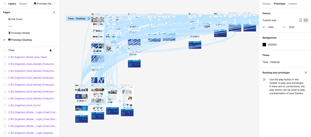
It was time to test our new design with real users. After some prototyping, recruiting and script preparations. The Checkout flow was tested with five users by the brasil UX research team. Three users for desktop and two users for mobile.
Testing Results
Results were satisfactory! We had some interaction details to adjust that came through the testing, but we were able to accomplish our main goal:
Reduce the friction and make a more understandable and usable site that will make a more smooth purchase.
The problems we tackled and are now applied in the launched version are:
- Direct buttons that led the user know how to go back or advance during navigation – i.e., specific Home button in the nav bar (Not hidden in the logo anymore)
- Give more relevance to the products in the hierarchy home page architecture to simplify the effort on searching them inside submenus.
- Now products are clustered depending on the target user to ease the user’s cognitive load.
- Product cards show concrete main information of the product and iconography for fast recognition.
- Checkout process is ordered in a mental model way (fill information starting from the top up to the bottom).
- Step by step process for checkout, always giving status to the user on which step he is.
- Error prevention inputs to help user recover easily and prevent frustration. (enabled buttons, red highlights and helper texts).
- More descriptive iconography and tooltips to explain details that help our elder users.
Thank you ♥
← Previous
Next →
Copyright © 2021 Ana Miraceti | anamiraceti@gmail.com
